Between Art and Content:
Building a Podcast Campaign in the Algorithm Age
Note: Additional podcast references and source links are included in the SoundCloud episode description.
Reflecting on Art, Content and Digital Identity
Is This Art or Content? Creativity in the Algorithm Age began as a project exploring the opportunities and tensions social media creates within the arts and creative industries. I was interested in the way platforms like Instagram can help artists reach wider audiences, build communities and share work independently, while also creating pressure to constantly package creativity into visible, measurable content. My aim was to explore this fine line between art and content, while also creating a social media campaign that reflected the same question visually and strategically.
My creative vision was guided by the idea that social media can be both expressive and strategic. Sutherland (2024) argues that effective social media practice involves more than simply posting; it requires audience understanding, content creation, storytelling and strategic communication. This influenced my decision to build the campaign as a three-part narrative across Instagram: a teaser reel, an educational carousel and an “out now” audio reel. Each post had a different purpose, but together they introduced the concept, expanded on the theme and encouraged audiences to listen to the podcast.
Creating the Campaign
The first post was a stop motion reel using handmade clay letters spelling “Is this art or content?” This was important because the making process itself reflected the podcast’s central question. I created the letters from air-dry clay, painted them in my brand colours, arranged them on torn paper and photographed the movement frame-by-frame. Although the final reel worked as promotional content for the podcast, the process was slow, tactile and artistic. This helped communicate the blurred relationship between creative labour and content strategy.

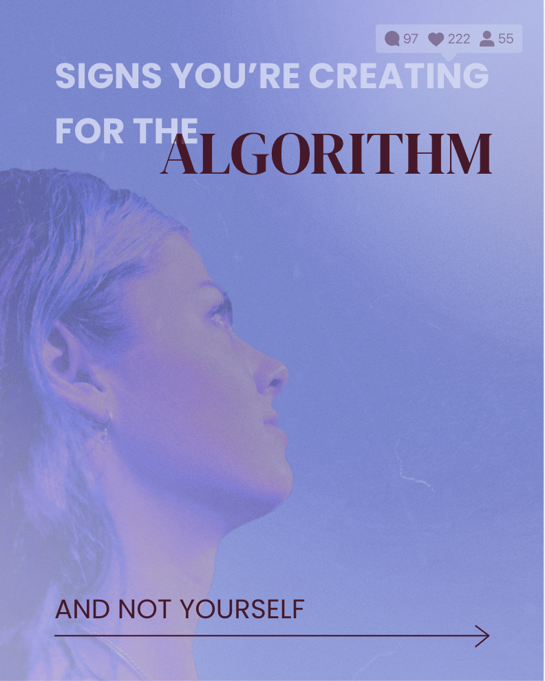
The second post was an Instagram carousel titled Signs You’re Creating for the Algorithm, Not Yourself. This translated ideas from the podcast into a more accessible and shareable format. I used an editorial collage style with my own imagery, Canva frames, Canva grain effects and gradient elements, minimal typography and a muted colour palette. Sutherland’s discussion of semiotics and Gestalt principles helped me consider how visual elements communicate meaning and how layout can guide audience interpretation. I wanted each slide to feel visually interesting while still being clear and easy to understand, especially for users scrolling quickly through Instagram.

The final post was an “out now” reel using an audio snippet from the podcast. I created this in Canva, which was a new tool for me. I found it useful for making simple animated graphics and combining typography, imagery, movement and sound. I also used Photoshop to prepare visual assets and GarageBand to record and edit the podcast, including intro and outro music, sound effects, volume automation and audio ducking. This process helped me develop skills in audio production, visual branding, motion design and platform-specific content creation.

Creative reflection and next steps
Bosello and van den Haak’s (2022) article helped me evaluate Instagram more critically. They explain that social media is often discussed as participatory and democratising, but their research found that Instagram is frequently used in more promotional or one-directional ways by arts institutions. This connected strongly to my podcast topic. While I used Instagram to promote my work, I also wanted my posts to invite reflection rather than simply advertise. The carousel, in particular, was designed to speak to other creatives who may recognise the pressure of making work for engagement, trends or algorithmic visibility.
A strength of my process was the cohesive visual identity. My design background helped me make decisions around colour, typography, composition and hierarchy. I also used mostly original imagery, which made the campaign feel personal and authentic. A challenge was the time required to learn new tools and produce handmade media. The stop motion, carousel and audio reel all took longer than expected, especially while balancing experimentation with technical polish. I also learned the importance of careful proofreading and final checks when producing professional-facing content.
Overall, this project strengthened my interest in branding, social media strategy, digital storytelling and creative direction. It showed me that social media can be a powerful space for artists and designers when used intentionally, not just reactively. Moving forward, I am interested in applying these skills to freelance design, content creation, social media management and creative communication roles. I am open to opportunities where I can combine visual design, strategy and storytelling to create thoughtful digital content for brands, creatives and cultural projects.
Refrences
Blog Post: Scholarly Sources
Bosello, G., & van den Haak, M. (2022). #Arttothepeople? An exploration of Instagram’s unfulfilled potential for democratising museums. Museum Management and Curatorship, https://www.tandfonline.com/doi/full/10.1080/09647775.2021.2023905
Sutherland, K. E. (2024). Strategic social media management: Theory and practice. https://link.springer.com/book/10.1007/978-981-99-9496-0
Media Credits
Post 1: Designed and created by Indigo Fletcher using:
– Apple Stop Motion
– Royalty-free audio, Set A Tone by Half.cool
Post 2: Designed and created by Indigo Fletcher using:
– Canva & Adobe Photoshop
– Retro TV Mockup https://unblast.com/retro-tv-mockup/
– Yellow Masking Tape and Ripped by Federica Giacomazzi
– Instagram Instagram Interface Instagram Icon Instagram Notification New Followers Notification by titileedz
– Film Texture Overlay Frame by Sketchify
– Gradient that fades to transparency by Marketplace Designers
– Polaroid Photo Frame by Canva Creative Studio
– Phone Frame Grey by Canva Creative Studio
– Clean Minimal Social Media Post Square Feed by Sketchify
Unless otherwise stated, all other imagery was created and photographed by Indigo Fletcher. Imagery also includes portraits photographed by Katalin Fletcher on Slide 1 and Samuel Excersel on Slide 5.
Post 3: Designed and created by Indigo Fletcher using:
– Canva & Adobe Photoshop
– Royalty-free audio: In Your Blood by Jamendo, Adobe Stock Asset
ID: #449240428. stock.adobe.com/au/search/audio?k=449240428
– Yellow Masking Tape and Ripped by Federica Giacomazzi
Unless otherwise stated, all imagery was created and photographed by Indigo Fletcher.


